Math test
Name: Date:
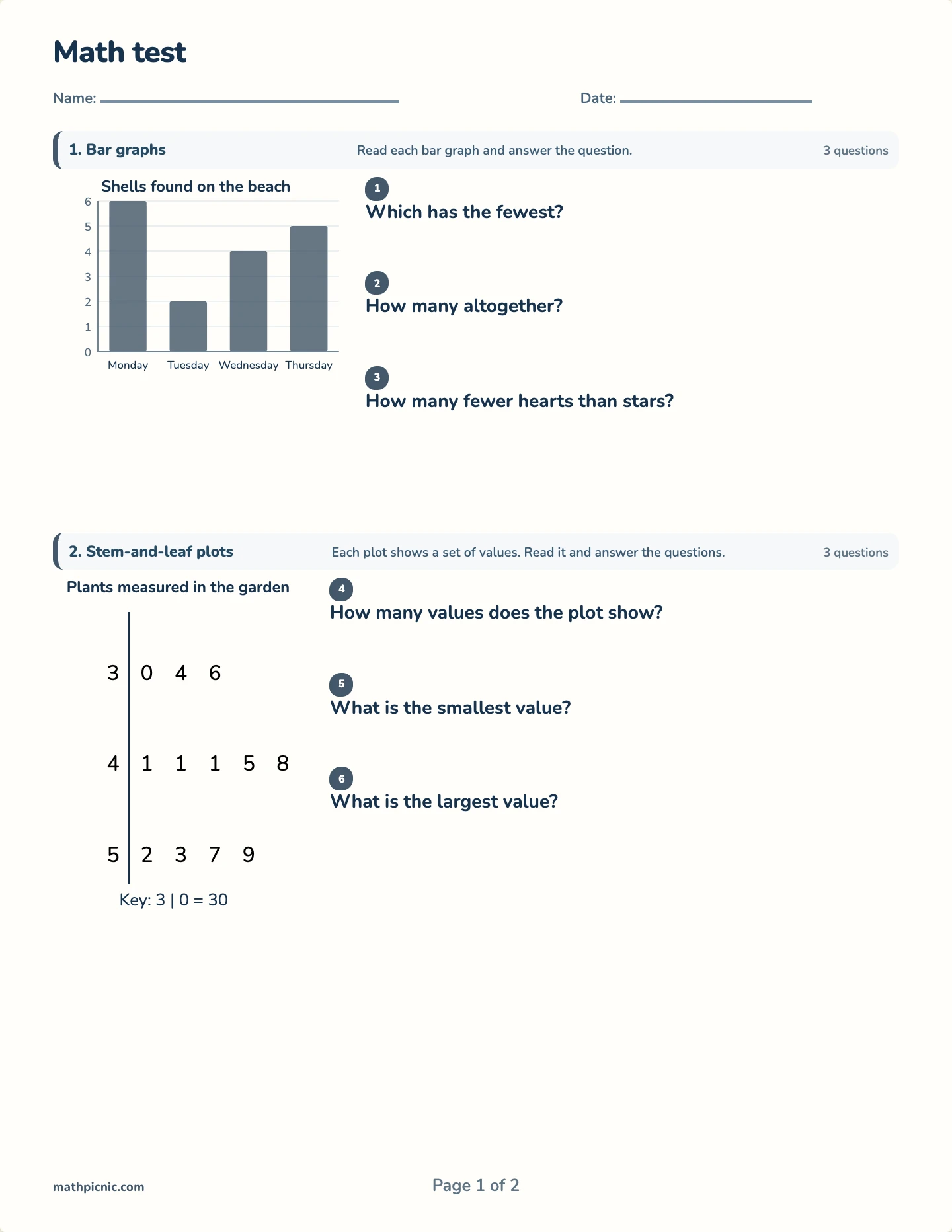
1. Bar graphsRead each bar graph and answer the question.3 questions
1
Which has the fewest?
2
How many altogether?
3
How many fewer hearts than stars?

Four ways of drawing data, each answering a question the others cannot.
The answer key prints on a separate page.
Each display on this paper exists because it answers a different question, and the reliable error is reading one as though it were another. A bar graph compares categories; a stem-and-leaf plot shows the shape of a distribution while keeping every value; a box plot throws the values away to show spread — median, quartiles, and range at a glance; a scatter plot asks whether two things move together at all. Mixing them checks whether a child reads the display or just the tallest bar.
The box plot is where that goes wrong most often. It looks like it should be counting something, and it is not — a wide box means the middle half of the data is spread out, not that there is more of it. The scatter plot closes the paper with the one question none of the others ask: not how much, but whether more of this comes with more of that.