
How to read each graph
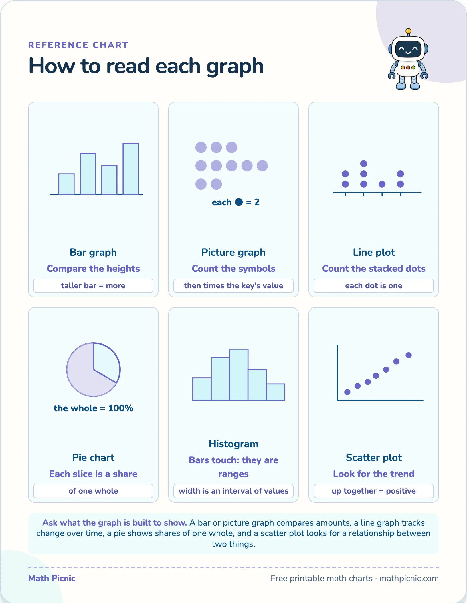
Six kinds of graph a child meets, each drawn small with the single instruction that unlocks it. The trick is knowing what question each display was built to answer.
Reference chart
How to read each graph

Bar graph
Compare the heights
taller bar = more
Picture graph
Count the symbols
then times the key's value
Line plot
Count the stacked dots
each dot is one
Pie chart
Each slice is a share
of one whole
Histogram
Bars touch: they are ranges
width is an interval of values
Scatter plot
Look for the trend
up together = positive
Ask what the graph is built to show. A bar or picture graph compares amounts, a line graph tracks change over time, a pie shows shares of one whole, and a scatter plot looks for a relationship between two things.
What's on this chart
Every kind of graph is built to answer one kind of question, and reading one starts with knowing which. A bar graph and a picture graph both compare amounts — taller bars and more symbols mean more — but a picture graph hides a step: each symbol stands for a number set by the key, so counting symbols is only half the job. A line plot stacks a dot for every value, so the answer is a count of dots above a number.
Why this chart helps
The other three carry a twist worth pointing out. A pie chart shows shares of a single whole, so every slice is a fraction of 100% rather than a raw count. A histogram looks like a bar graph but its bars touch, because each one covers a range of values, not a single category. A scatter plot is the odd one out entirely: its job is not to report amounts but to reveal whether two things move together.
More printable charts
- Counting to 10
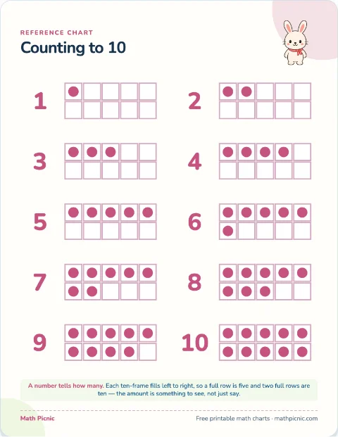 Print Count the dots in each ten-frame and read the number beside it.
 - Number bonds to 10
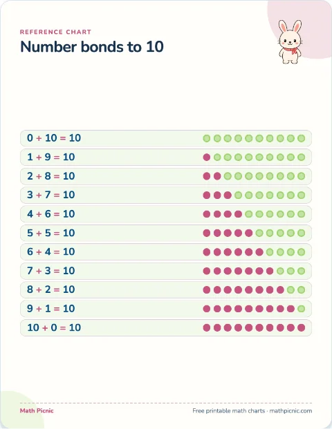 Print Read each row of counters and say the two numbers that make ten.
 - Comparing numbers
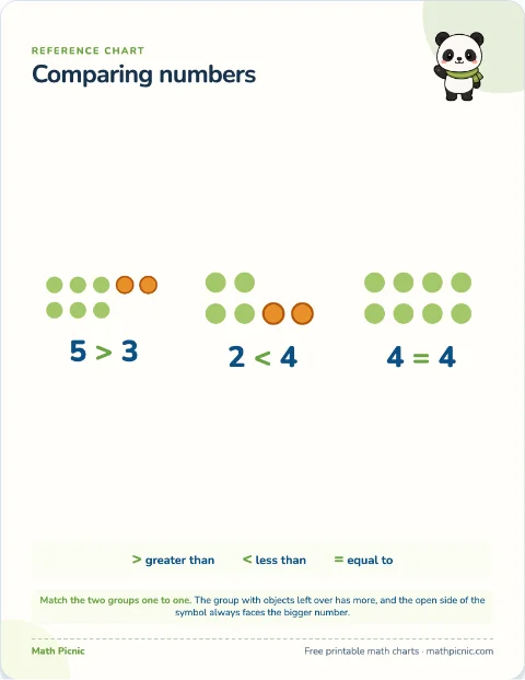 Print Line the two groups up one to one; the group with a leftover has more.
 - Odd and even
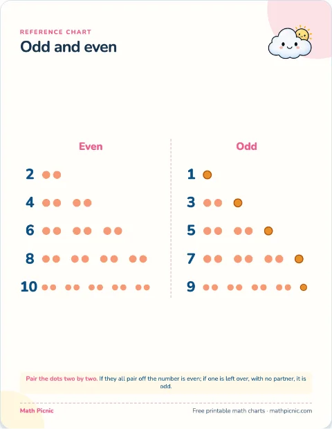 Print Pair the dots two by two; all paired is even, one left over is odd.
 - Number line 0–20
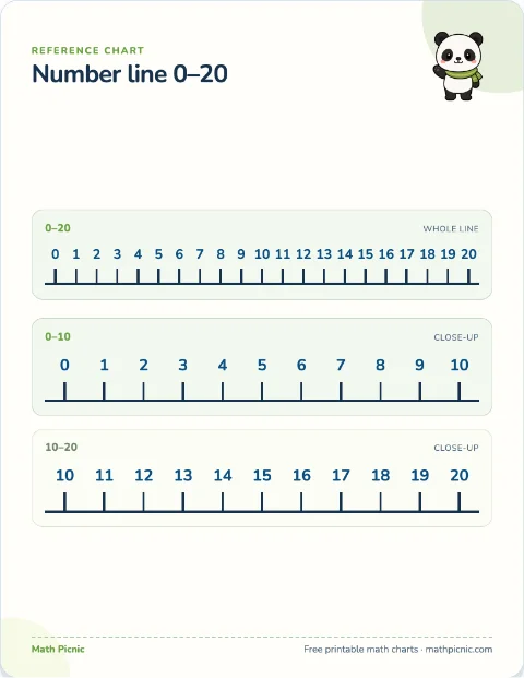 Print Count on or back by hopping along the line one number at a time.
 - Blank number line 0–20
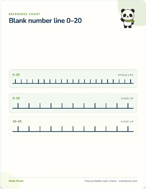 Print Label the ticks, mark a number, or draw equal jumps for an operation.
 - Number bonds to 20
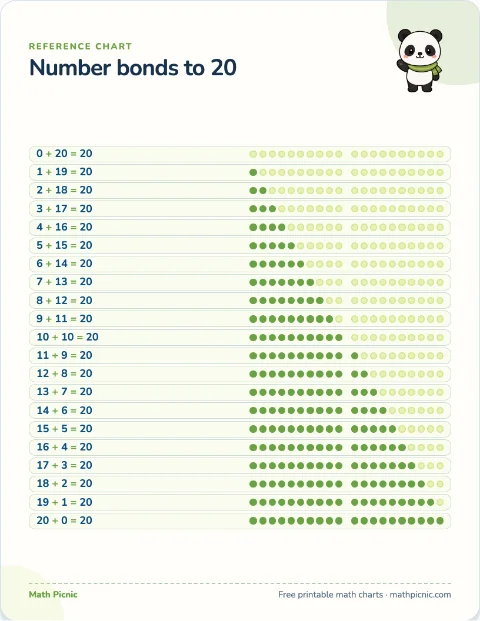 Print Count the two colors in a row and say the pair that makes twenty.
 - Telling the time
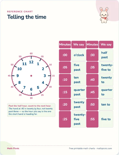 Print Read the hour inside the dial and the minutes printed outside it.